Home
Random
House
Children's Books Home
Babies & Toddlers (0-2)
Preschoolers (3–5)
Growing Readers (6–8)
Tweens (9–12)
Teens (13+)
Newsletter
Menu
R
a
n
d
o
m
H
o
u
s
e
B
o
o
k
s
f
o
r
C
h
i
l
d
r
e
n
o
f
A
l
l
A
g
e
s
Home
Random
House
Children's Books Home
Babies & Toddlers (0-2)
Preschoolers (3–5)
Growing Readers (6–8)
Tweens (9–12)
Teens (13+)
Newsletter
Menu
Search for books
Submit Search
Browse Our Latest Releases for...
Babies & Toddlers
0-2
Preschoolers
3–5
Growing Readers
6–8
Tweens
9–12
Teens
13+
Newsletter
close alert message
previous book
next book
Recommendations
for all ages
Babies & Toddlers
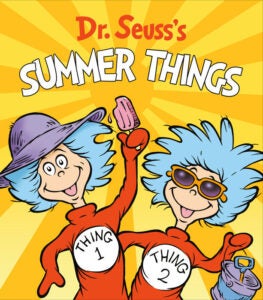
Dr. Seuss's Summer Things
Preschoolers
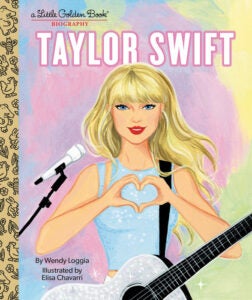
Taylor Swift: A Little Golden Book Biography
Growing Readers
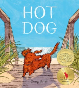
Hot Dog
Tweens
Maizy Chen's Last Chance
For Babies & Toddlers
You Are a Unicorn!: A Little Book of AfroMations
by
April Showers
Gabrielle (Sesame Street Friends)
by
Andrea Posner-Sanchez
Elmo and Abby's Playdate (Sesame Street)
by
Cat Reynolds
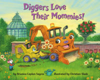
Diggers Love Their Mommies!
by
Brianna Caplan Sayres
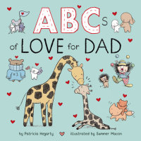
ABCs of Love for Dad
by
Patricia Hegarty
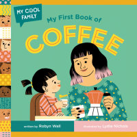
My First Book of Coffee
by
Robyn Wall
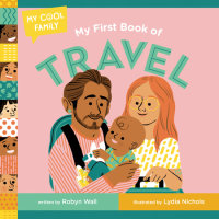
My First Book of Travel
by
Robyn Wall
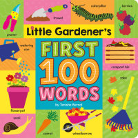
Little Gardener's First 100 Words
by
Tenisha Bernal
For Preschoolers
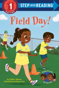
Field Day!
by
Candice Ransom
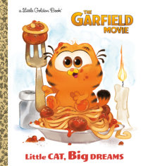
Little Cat, Big Dreams (The Garfield Movie)
by
Golden Books
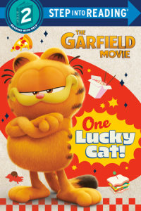
One Lucky Cat! (The Garfield Movie)
by
Random House
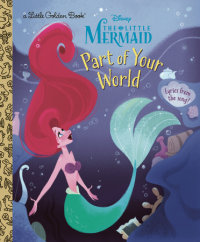
Part of Your World (Disney Princess)
by
Howard Ashman
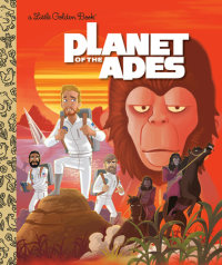
Planet of the Apes (20th Century Studios)
by
Patrick Spaziante
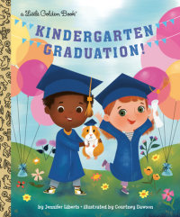
Kindergarten Graduation!
by
Jennifer Liberts
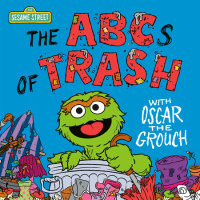
The ABCs of Trash with Oscar the Grouch (Sesame Street)
by
Andrea Posner-Sanchez
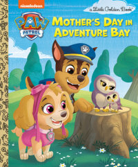
Mother's Day in Adventure Bay (PAW Patrol)
by
Matt Huntley
For Growing Readers
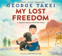
My Lost Freedom
by
George Takei
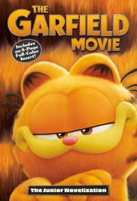
The Garfield Movie: The Junior Novelization
by
David Lewman
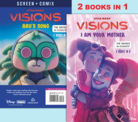
I Am Your Mother/Aau's Song (Star Wars Visions)
by
RH Disney
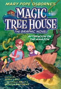
Afternoon on the Amazon Graphic Novel
by
Mary Pope Osborne
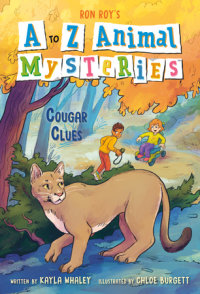
A to Z Animal Mysteries #3: Cougar Clues
by
Ron Roy
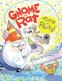
Gnome and Rat: Time to Party!
by
Lauren Stohler
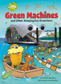
Green Machines and Other Amazing Eco-Inventions
by
Michelle Meadows
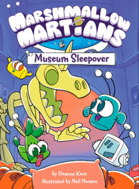
Marshmallow Martians: Museum Sleepover
by
Deanna Kent
For Tweens
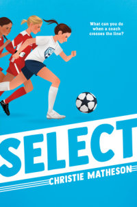
Select
by
Christie Matheson
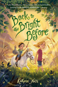
Back to the Bright Before
by
Katherin Nolte
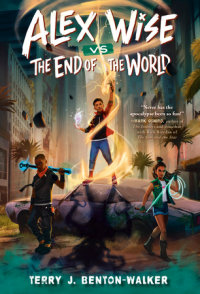
Alex Wise vs. the End of the World
by
Terry J. Benton-Walker
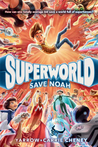
Superworld: Save Noah
by
Yarrow Cheney
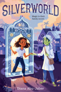
Silverworld
by
Diana Abu-Jaber
Spellbinders: The Not-So-Chosen One
by
Andrew Auseon
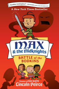
Max and the Midknights: Battle of the Bodkins
by
Lincoln Peirce
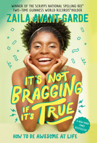
It's Not Bragging If It's True
by
Zaila Avant-garde
Random House Children's Books